
2021
Goodyear
Branding
Packaging
Intro
Reinventing an icon by Building Street Cred & Banking on Brand Loyalty.
The Goodyear line of licensed products asked me to help them expand into a full line of motor oils and coolant manufactured and distributed under the Goodyear Lubricants brand. From extreme performance motor oils, antifreeze, DEF and chemicals, Goodyear Lubricants has begun producing product applications ranging from passenger car motor oils (PCMO) to diesel fleets to heavy construction and industrial applications.
Goodyear Lubricants needed a new brand identity that complemented the Goodyear reputation that, for over 100 years, stands for reliability and performance on the road and the track. With all that in mind, I got revved up, put rubber to the road and started on what would be a modern update to a well-known household name. Okay, I’m done with the racing puns now.


Bringing the product to life.
Every great brand has an identifiable look that immediately makes you think of that brand name. These pieces are a crucial part of Goodyear Lubricants’ face-to-face business interactions in the field. Design-wise, I started with the vibrant gold and blue that the Goodyear brand is known for. From there, I elevated the traditional labels to new heights with modern creative elements that had never before been used on Goodyear tire packaging or their racing materials. Talk about an oil change.
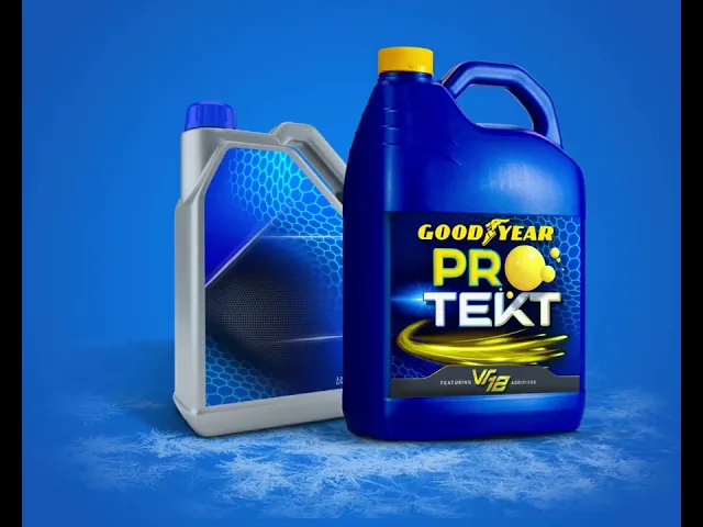
This made Goodyear Lubricants’ labels unique without losing the important brand trust that has been established for over 100 years. That’s a pretty long time, you know. The Performance Max motor oil product line came first, and the next task was Goodyear Lubricants’ antifreeze label, ProTekt VR12.
Completely new products meant new product packaging design and labels. My team brainstormed product packaging designs that would be both functional and adaptable. This meant working with the Goodyear team to incorporate all of the required product information on the various bottle sizes and shapes while also maintaining a new brand consistency throughout all the consumer packaging elements. Then, it was up to me to photograph the product bottles and packaging so we could digitally composite the new label designs on them for the website and later projects. This involved a multi-step, multi-day process that took some serious skill, of course.


The Results
The digital identity of Goodyear Lubricants had to be as recognizable and impactful as that of Goodyear Tires. The website brought it all together and highlighted the updated, modern elements we developed in the product packaging design creation process for the lubricant and antifreeze products. Not only that, but it also showcased the breadth of products that Goodyear Lubricants offers without it looking as though we tried too hard to cram too many things into one image or one page. Mission accomplished.
After all, the products are the star of this site and the brand.
That had to come across in the product packaging design and the copy. Creating a comprehensive message around the high-quality of ingredients and value was important for Goodyear Lubricants. There also needed to be a functional, organized way to digest an entire list of product SKUs. Enough said.
The website then inspired the look of Goodyear Lubricants’ social media presence and email templates that would feed marketing campaigns to come.

More Works
RemBrandit®
2026


FAQ
01
What does working together look like?
02
How do you price projects?
03
Do you take one-off projects or ongoing work?
04
What results can I expect?
05
What do you need from me to get started?
06
What can you take on?
07
Can you work with my in-house team or agency?
2021
Goodyear
Branding
Packaging
Intro
Reinventing an icon by Building Street Cred & Banking on Brand Loyalty.
The Goodyear line of licensed products asked me to help them expand into a full line of motor oils and coolant manufactured and distributed under the Goodyear Lubricants brand. From extreme performance motor oils, antifreeze, DEF and chemicals, Goodyear Lubricants has begun producing product applications ranging from passenger car motor oils (PCMO) to diesel fleets to heavy construction and industrial applications.
Goodyear Lubricants needed a new brand identity that complemented the Goodyear reputation that, for over 100 years, stands for reliability and performance on the road and the track. With all that in mind, I got revved up, put rubber to the road and started on what would be a modern update to a well-known household name. Okay, I’m done with the racing puns now.
Bringing the product to life.
Every great brand has an identifiable look that immediately makes you think of that brand name. These pieces are a crucial part of Goodyear Lubricants’ face-to-face business interactions in the field. Design-wise, I started with the vibrant gold and blue that the Goodyear brand is known for. From there, I elevated the traditional labels to new heights with modern creative elements that had never before been used on Goodyear tire packaging or their racing materials. Talk about an oil change.
This made Goodyear Lubricants’ labels unique without losing the important brand trust that has been established for over 100 years. That’s a pretty long time, you know. The Performance Max motor oil product line came first, and the next task was Goodyear Lubricants’ antifreeze label, ProTekt VR12.
Completely new products meant new product packaging design and labels. My team brainstormed product packaging designs that would be both functional and adaptable. This meant working with the Goodyear team to incorporate all of the required product information on the various bottle sizes and shapes while also maintaining a new brand consistency throughout all the consumer packaging elements. Then, it was up to me to photograph the product bottles and packaging so we could digitally composite the new label designs on them for the website and later projects. This involved a multi-step, multi-day process that took some serious skill, of course.
The Results
The digital identity of Goodyear Lubricants had to be as recognizable and impactful as that of Goodyear Tires. The website brought it all together and highlighted the updated, modern elements we developed in the product packaging design creation process for the lubricant and antifreeze products. Not only that, but it also showcased the breadth of products that Goodyear Lubricants offers without it looking as though we tried too hard to cram too many things into one image or one page. Mission accomplished.
After all, the products are the star of this site and the brand.
That had to come across in the product packaging design and the copy. Creating a comprehensive message around the high-quality of ingredients and value was important for Goodyear Lubricants. There also needed to be a functional, organized way to digest an entire list of product SKUs. Enough said.
The website then inspired the look of Goodyear Lubricants’ social media presence and email templates that would feed marketing campaigns to come.
More Works
RemBrandit®
2026
FAQ
01
What does working together look like?
02
How do you price projects?
03
Do you take one-off projects or ongoing work?
04
What results can I expect?
05
What do you need from me to get started?
06
What can you take on?
07
Can you work with my in-house team or agency?
2021
Goodyear
Branding
Packaging
Intro
Reinventing an icon by Building Street Cred & Banking on Brand Loyalty.
The Goodyear line of licensed products asked me to help them expand into a full line of motor oils and coolant manufactured and distributed under the Goodyear Lubricants brand. From extreme performance motor oils, antifreeze, DEF and chemicals, Goodyear Lubricants has begun producing product applications ranging from passenger car motor oils (PCMO) to diesel fleets to heavy construction and industrial applications.
Goodyear Lubricants needed a new brand identity that complemented the Goodyear reputation that, for over 100 years, stands for reliability and performance on the road and the track. With all that in mind, I got revved up, put rubber to the road and started on what would be a modern update to a well-known household name. Okay, I’m done with the racing puns now.
Bringing the product to life.
Every great brand has an identifiable look that immediately makes you think of that brand name. These pieces are a crucial part of Goodyear Lubricants’ face-to-face business interactions in the field. Design-wise, I started with the vibrant gold and blue that the Goodyear brand is known for. From there, I elevated the traditional labels to new heights with modern creative elements that had never before been used on Goodyear tire packaging or their racing materials. Talk about an oil change.
This made Goodyear Lubricants’ labels unique without losing the important brand trust that has been established for over 100 years. That’s a pretty long time, you know. The Performance Max motor oil product line came first, and the next task was Goodyear Lubricants’ antifreeze label, ProTekt VR12.
Completely new products meant new product packaging design and labels. My team brainstormed product packaging designs that would be both functional and adaptable. This meant working with the Goodyear team to incorporate all of the required product information on the various bottle sizes and shapes while also maintaining a new brand consistency throughout all the consumer packaging elements. Then, it was up to me to photograph the product bottles and packaging so we could digitally composite the new label designs on them for the website and later projects. This involved a multi-step, multi-day process that took some serious skill, of course.
The Results
The digital identity of Goodyear Lubricants had to be as recognizable and impactful as that of Goodyear Tires. The website brought it all together and highlighted the updated, modern elements we developed in the product packaging design creation process for the lubricant and antifreeze products. Not only that, but it also showcased the breadth of products that Goodyear Lubricants offers without it looking as though we tried too hard to cram too many things into one image or one page. Mission accomplished.
After all, the products are the star of this site and the brand.
That had to come across in the product packaging design and the copy. Creating a comprehensive message around the high-quality of ingredients and value was important for Goodyear Lubricants. There also needed to be a functional, organized way to digest an entire list of product SKUs. Enough said.
The website then inspired the look of Goodyear Lubricants’ social media presence and email templates that would feed marketing campaigns to come.
More Works
2026
FAQ
What does working together look like?
How do you price projects?
Do you take one-off projects or ongoing work?
What results can I expect?
What do you need from me to get started?
What can you take on?
Can you work with my in-house team or agency?